FOOD
Hillshire Farm
•
Aidells
•
Kraft Homemade
•
Loaded Popcorn
•
So Delicious
•
Grooves
•
Hillshire Farm • Aidells • Kraft Homemade • Loaded Popcorn • So Delicious • Grooves •
HILLSHIRE FARM naturals
LOGO & IDENTITY
PACKAGING DESIGN
ART DIRECTION
a familiar brand. a new expression.
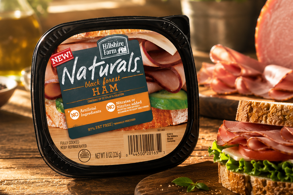
A refreshed identity and packaging system for Hillshire Farm, bringing the brand’s natural, farm-inspired character into a more contemporary expression.
a familiar brand. a new expression.
BEFORE
AFTER
Hillshire Farm has a rich visual heritage built around authenticity, quality, and the idea of food made with care.
The opportunity was to evolve that heritage without losing what makes the brand recognisable.
The result is a more confident identity that feels natural, approachable and relevant on shelf.
the answer wasn’t to reinvent Hillshire Farm.
it was to make natural feel new.
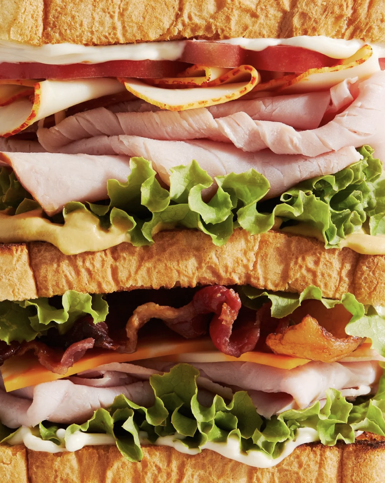
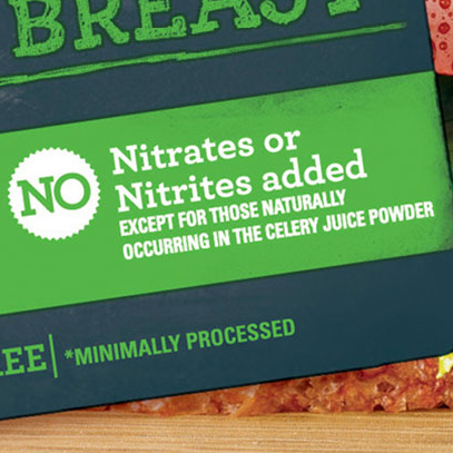
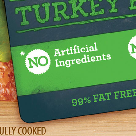
WHAT WE BUILT
Heritage
Natural quality
Approachability
Modern simplicity
These became the foundation for the new identity and packaging system.
the new HILLSHIRE FARM.
LOGO & IDENTITY
PACKAGING
BRAND SYSTEM
ART DIRECTION
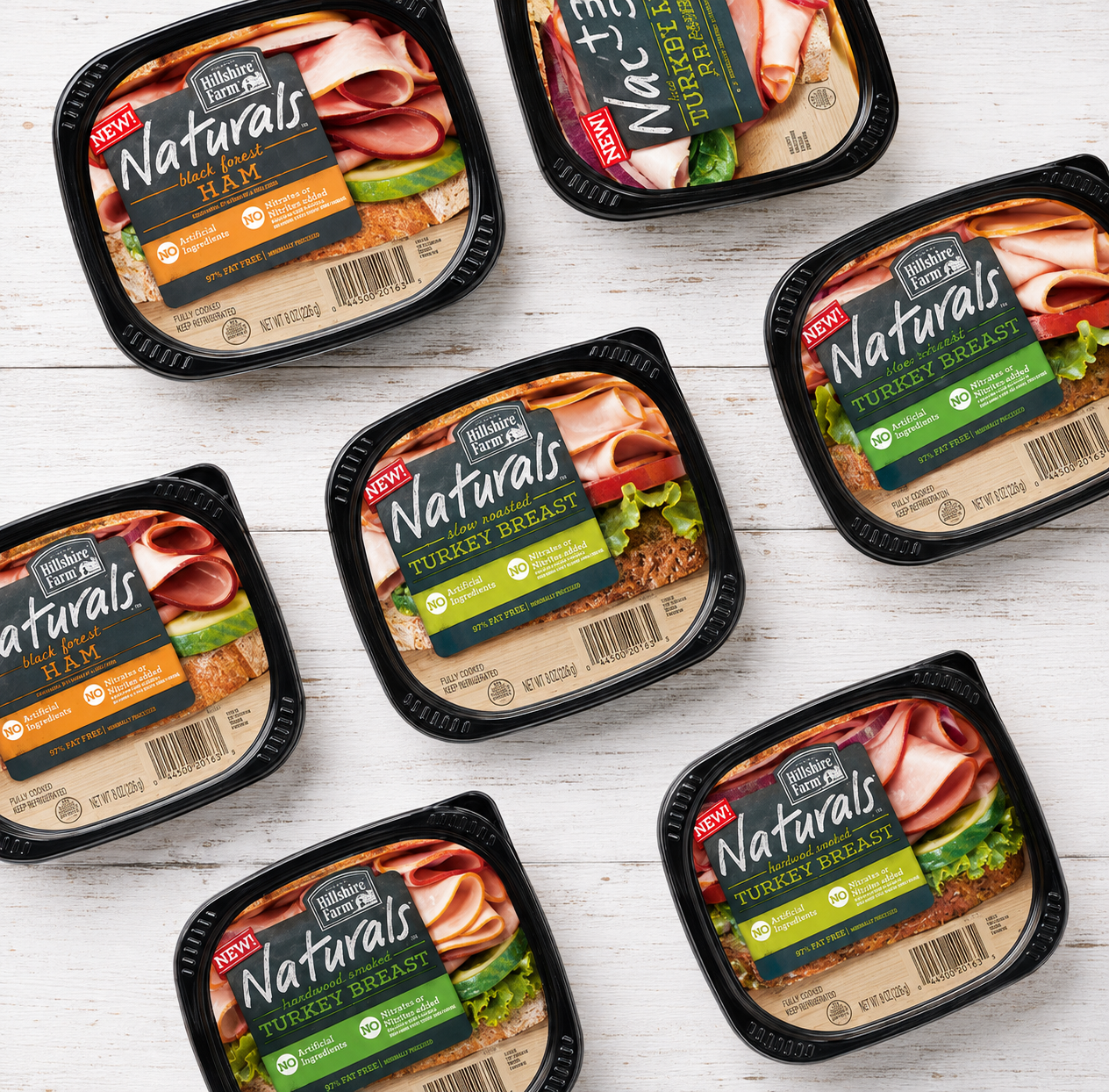
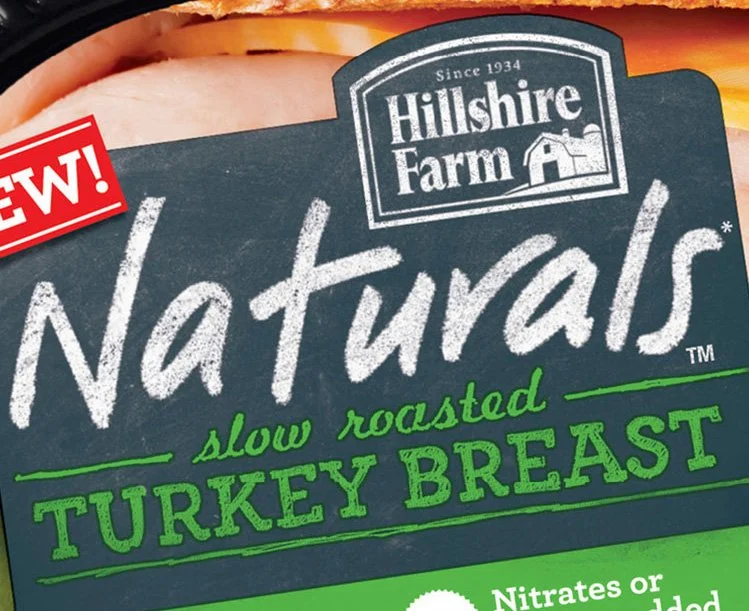
A refreshed logo gives the brand a stronger, more distinctive presence while retaining the familiar character of Hillshire Farm.
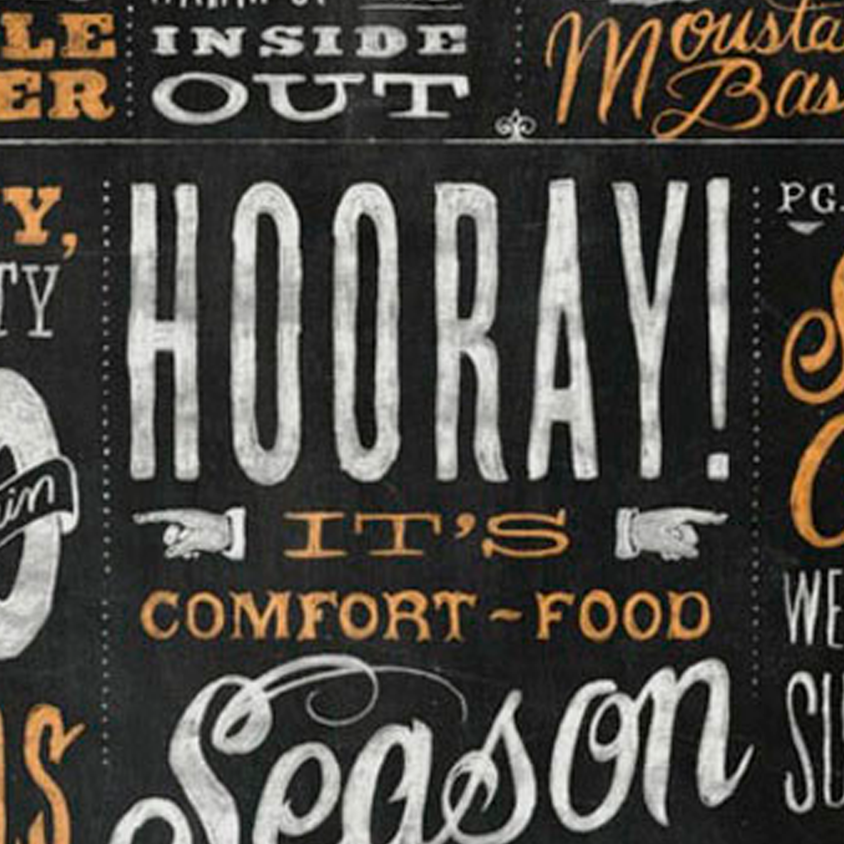
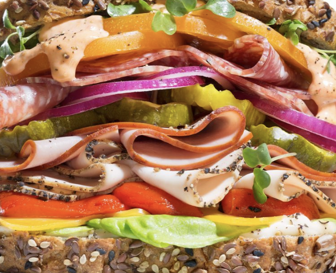
The visual language takes its cue from the hand-drawn chalkboards of neighborhood delis and farm shops, bringing a more human, handcrafted feel to the brand. Natural textures, expressive typography and honest food photography reinforce the idea of food that feels closer to the farm than the factory.
KRAFT homemade
LOGO & IDENTITY
PACKAGING
ART DIRECTION
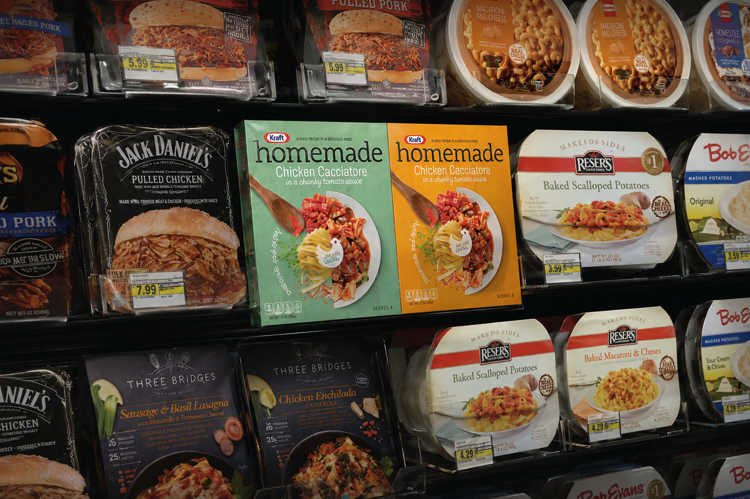
making homemade feel effortless.
Kraft wanted to bring restaurant quality meals into the everyday, combining convenience with the feeling of something made at home.
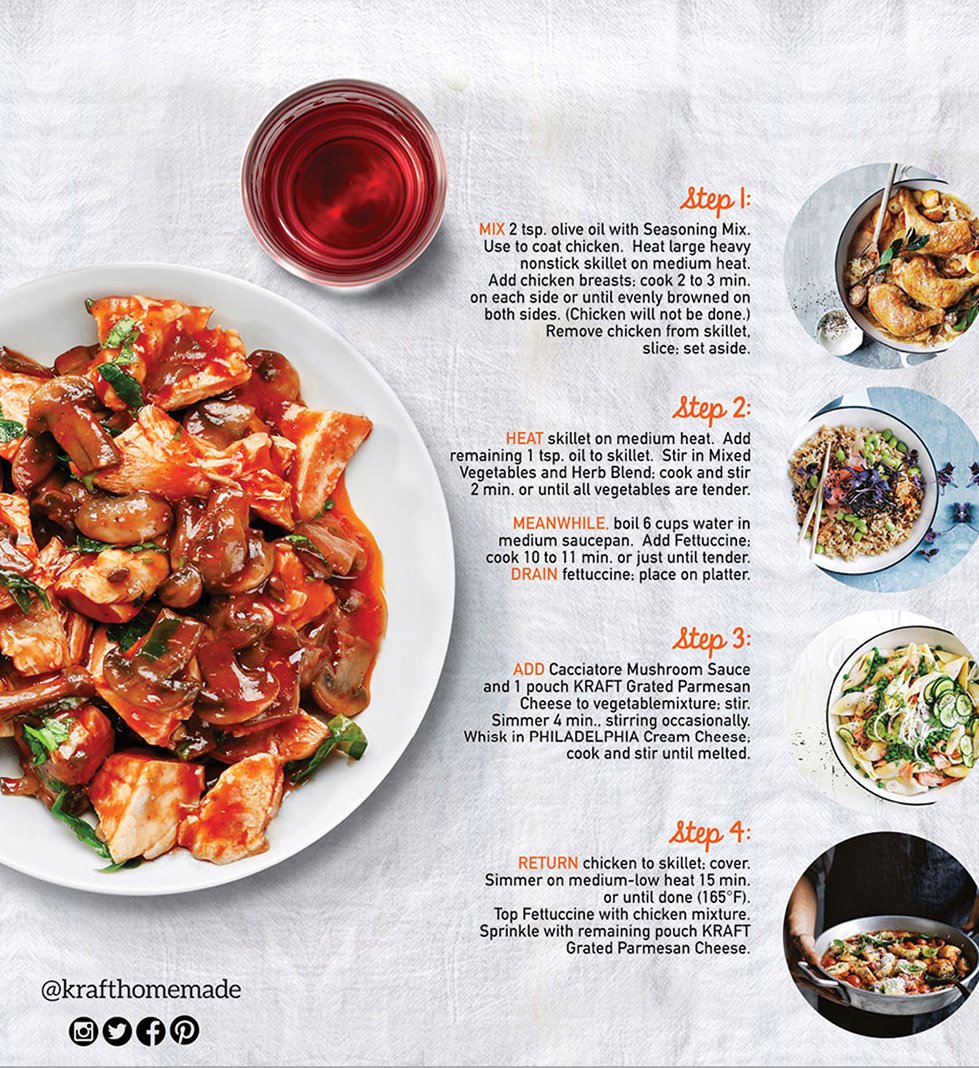
The solution was a packaging system built around appetite appeal, simplicity and shelf recognition.
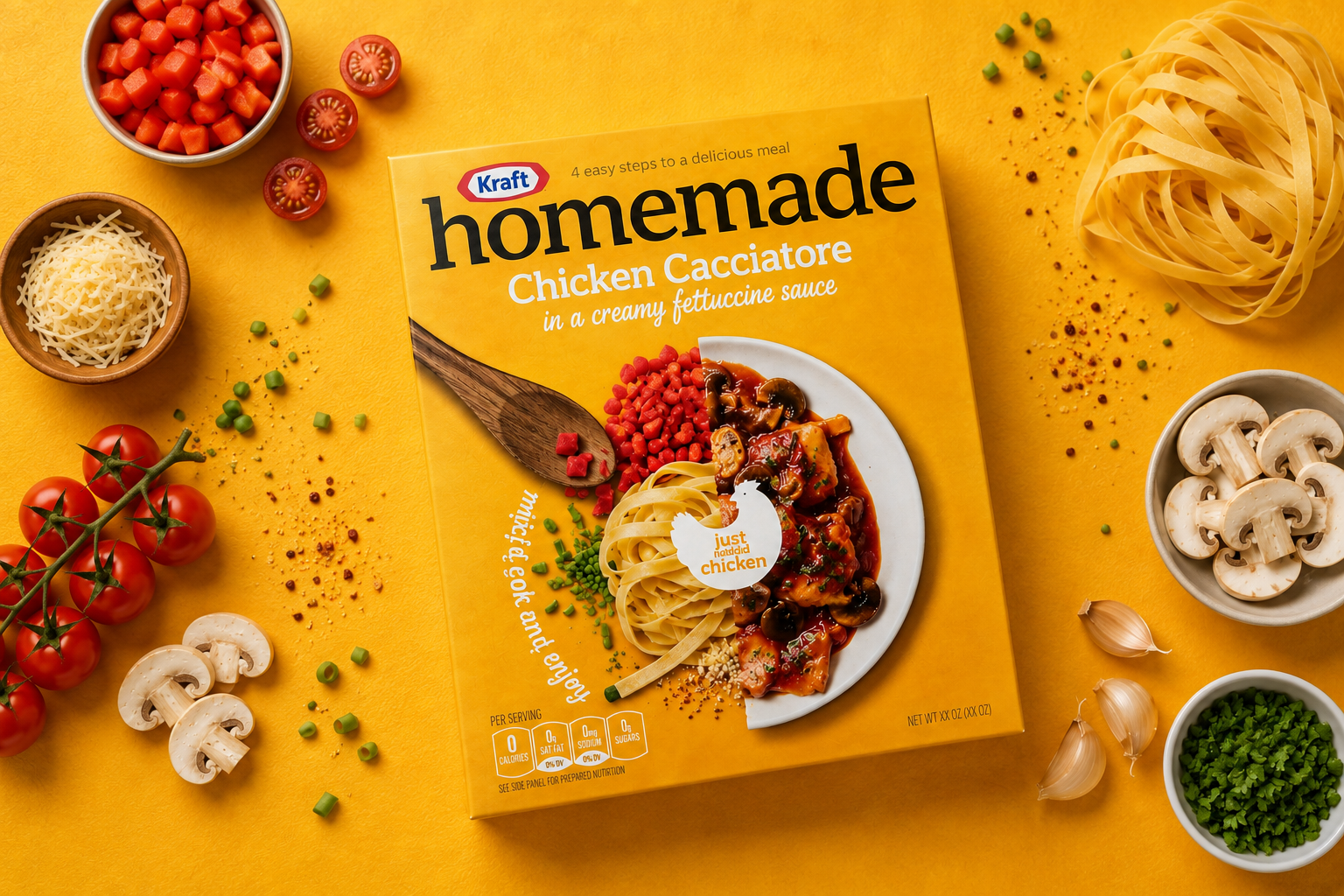
APPETITE Food-first imagery
SIMPLICITY Clear preparation cues
IMPACT Strong shelf presence
SO DELICIOUS cheesy
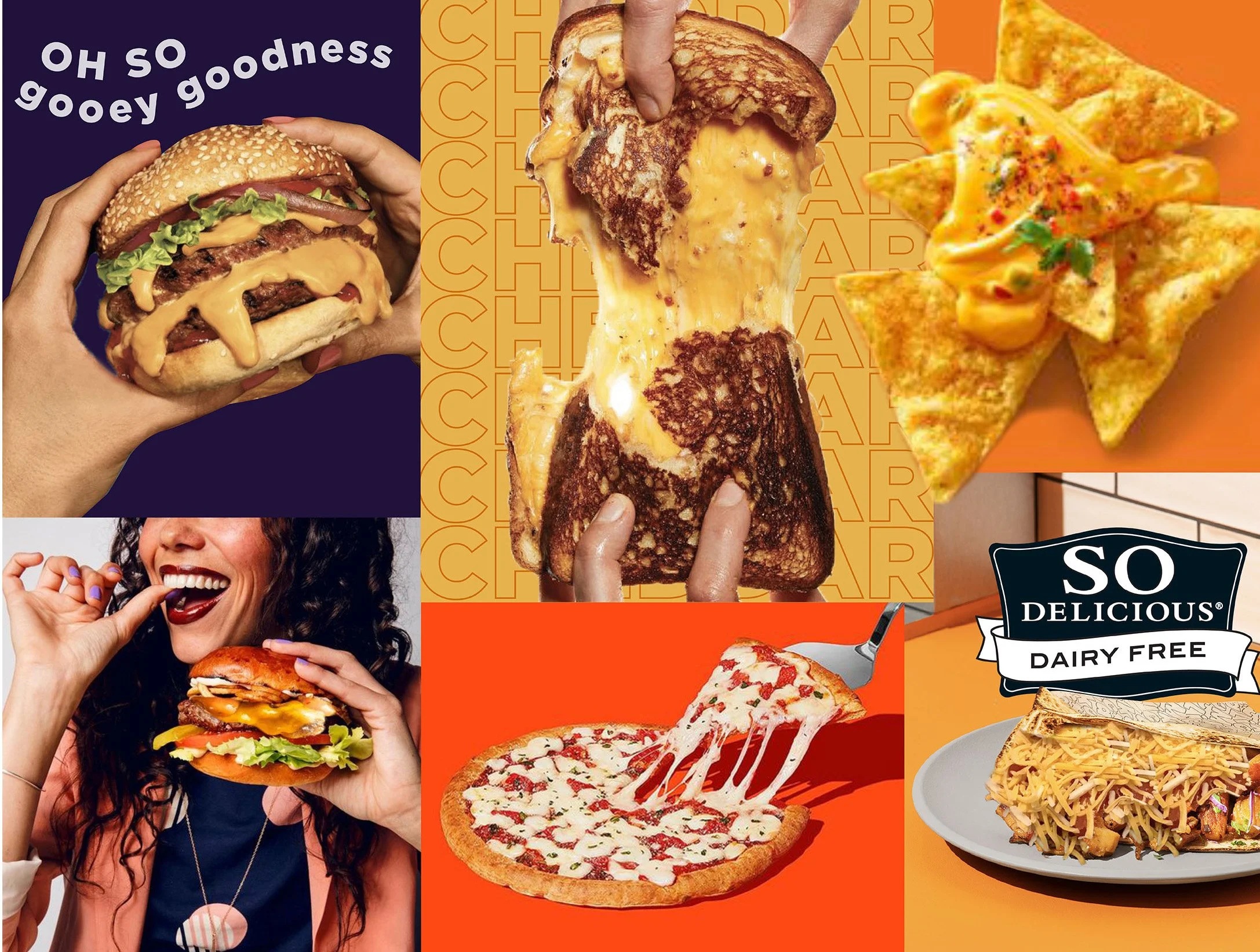
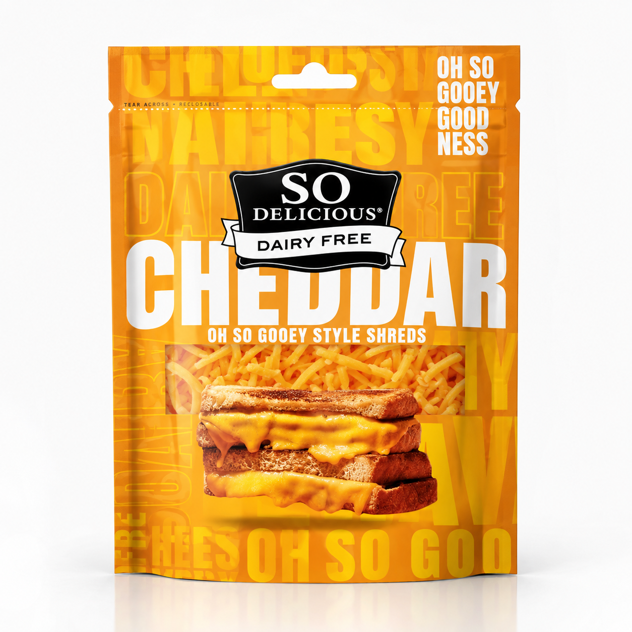
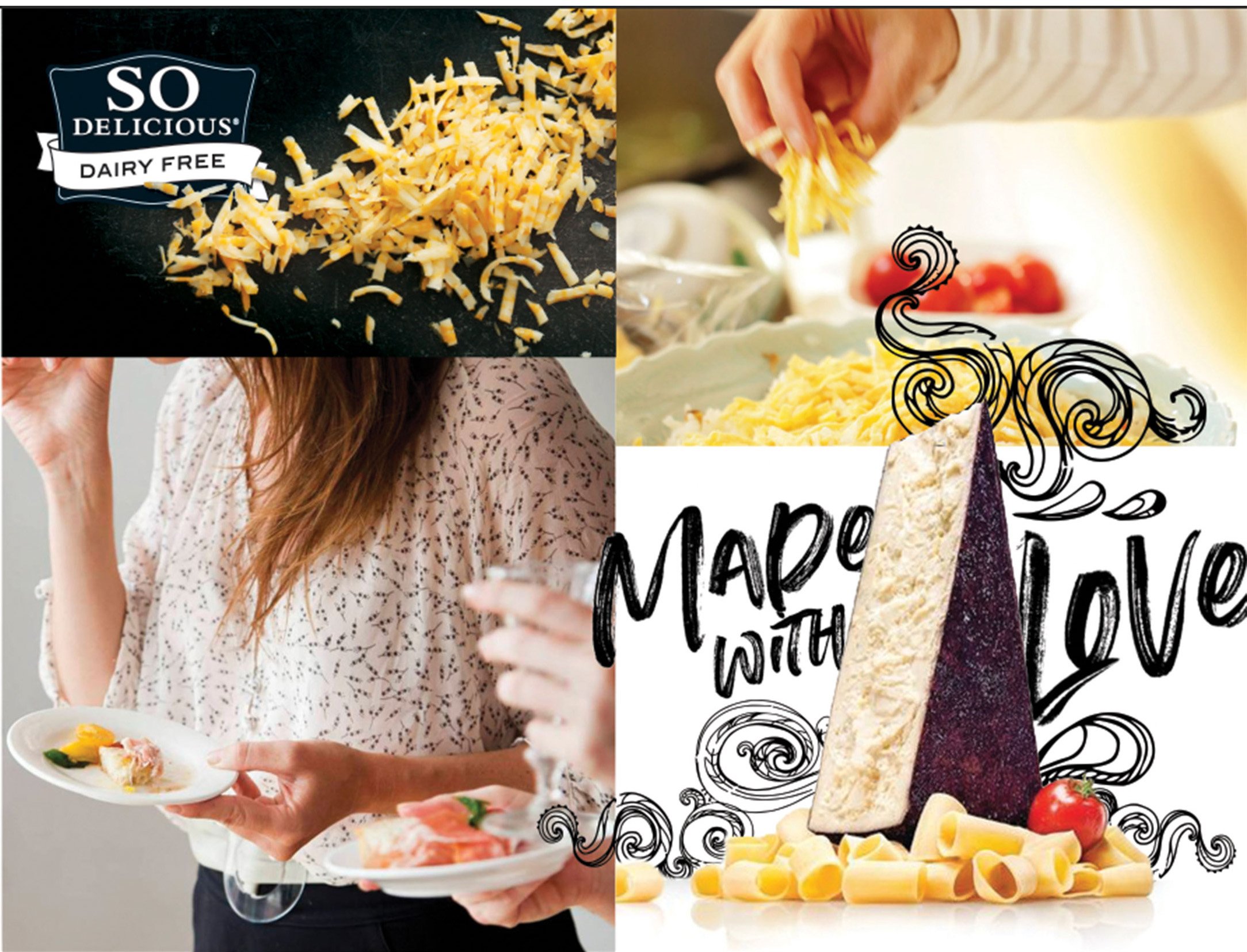
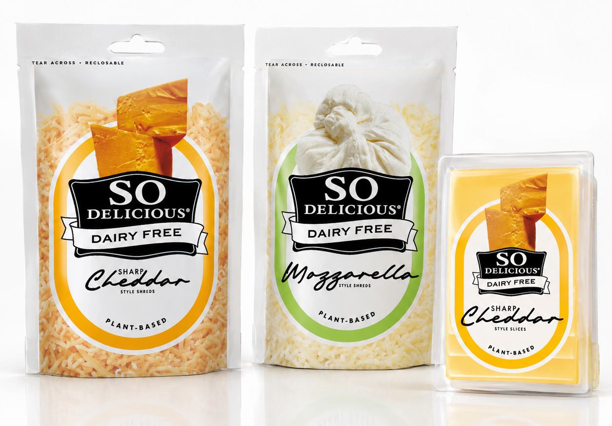
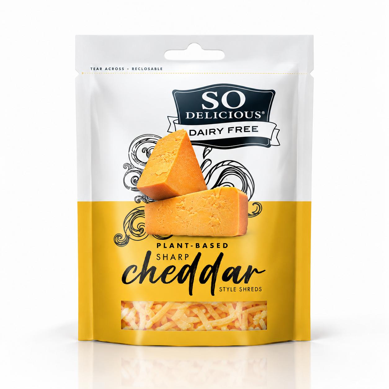
EXPLORING TWO VISUAL TERRITORIES FOR A MORE CRAVEABLE PLANT-BASED CHEESE EXPERIENCE.
The more energetic direction: saturated orange, gooey food photography, oversized typography, craveability.
bold + indulgent
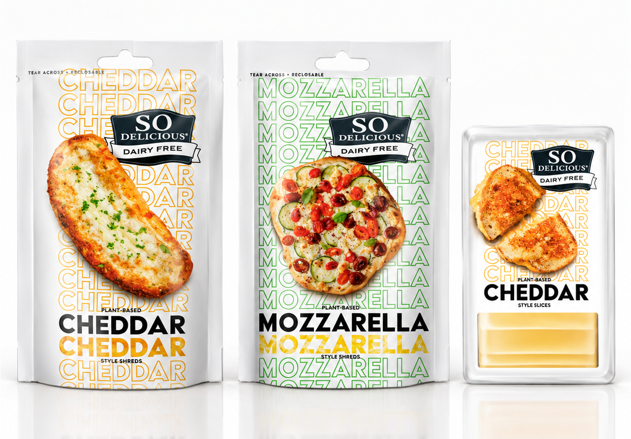
The more wholesome direction: lighter palette, ingredient photography, hand-drawn elements, “made with love” cues.
fresh + natural
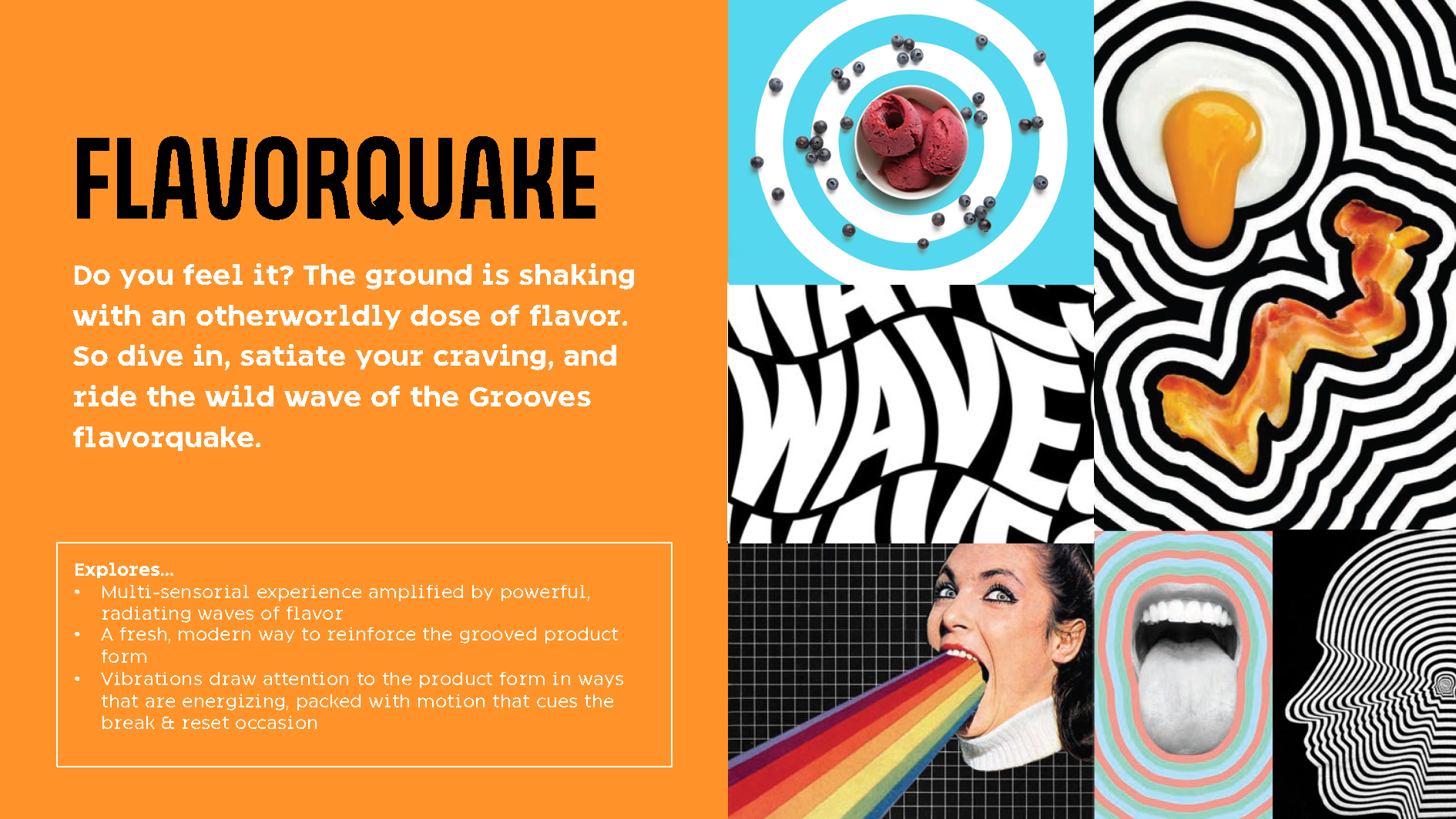
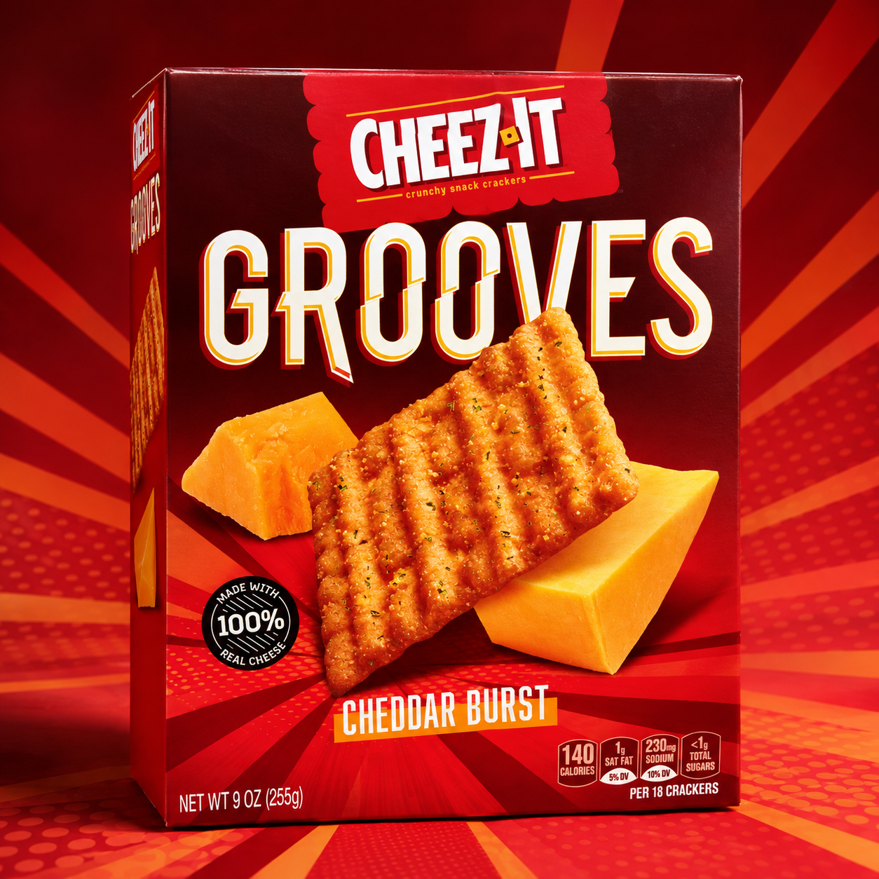
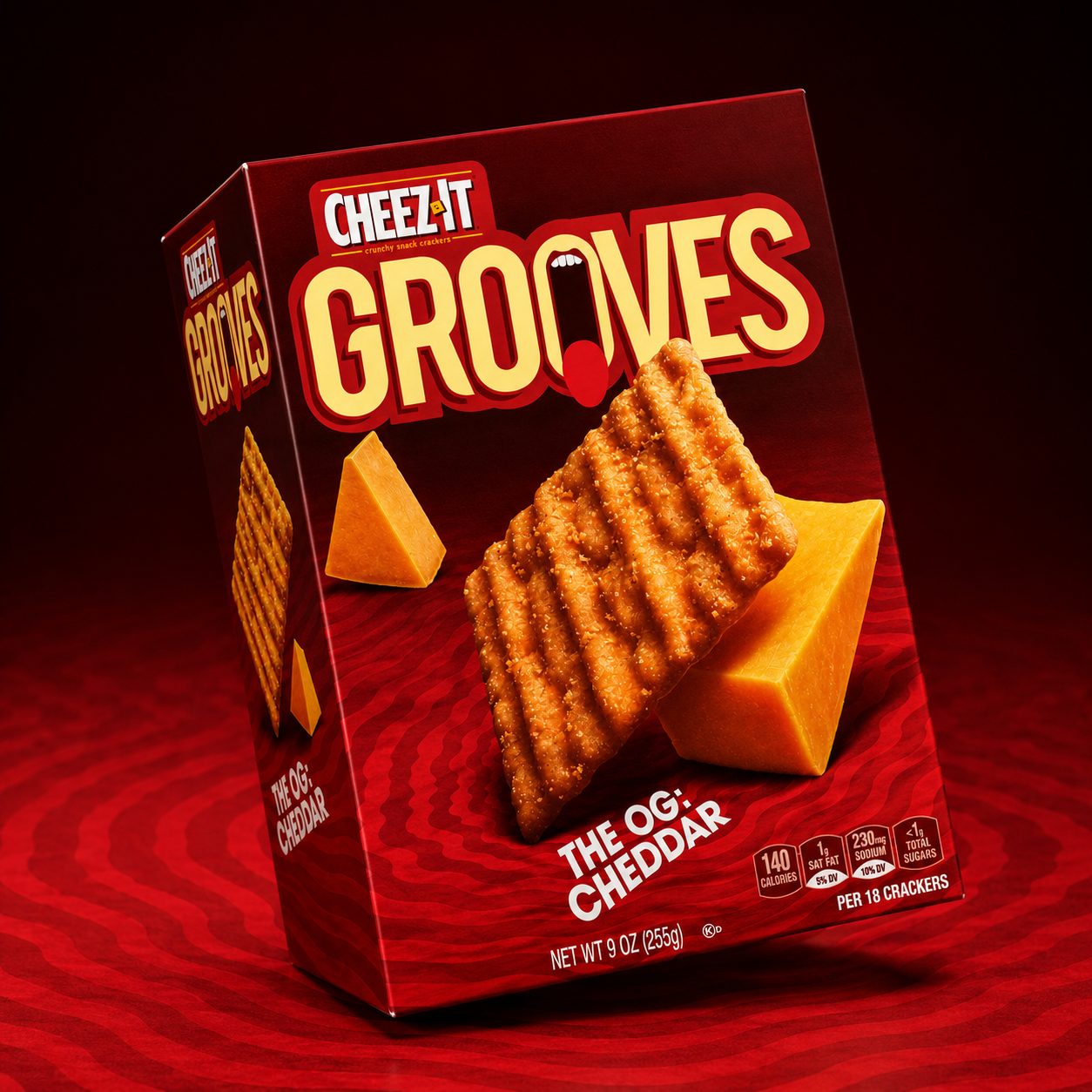
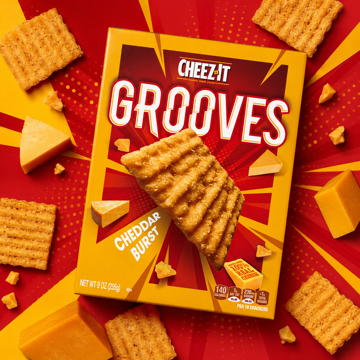
CHEEZ-IT grooves
LOGO & IDENTITY
PACKAGING
BRAND SYSTEM
ART DIRECTION
a bolder cheez-it
experience
A new range for Cheez-It Grooves, bringing more flavor, more personality and bigger taste to the snack aisle.
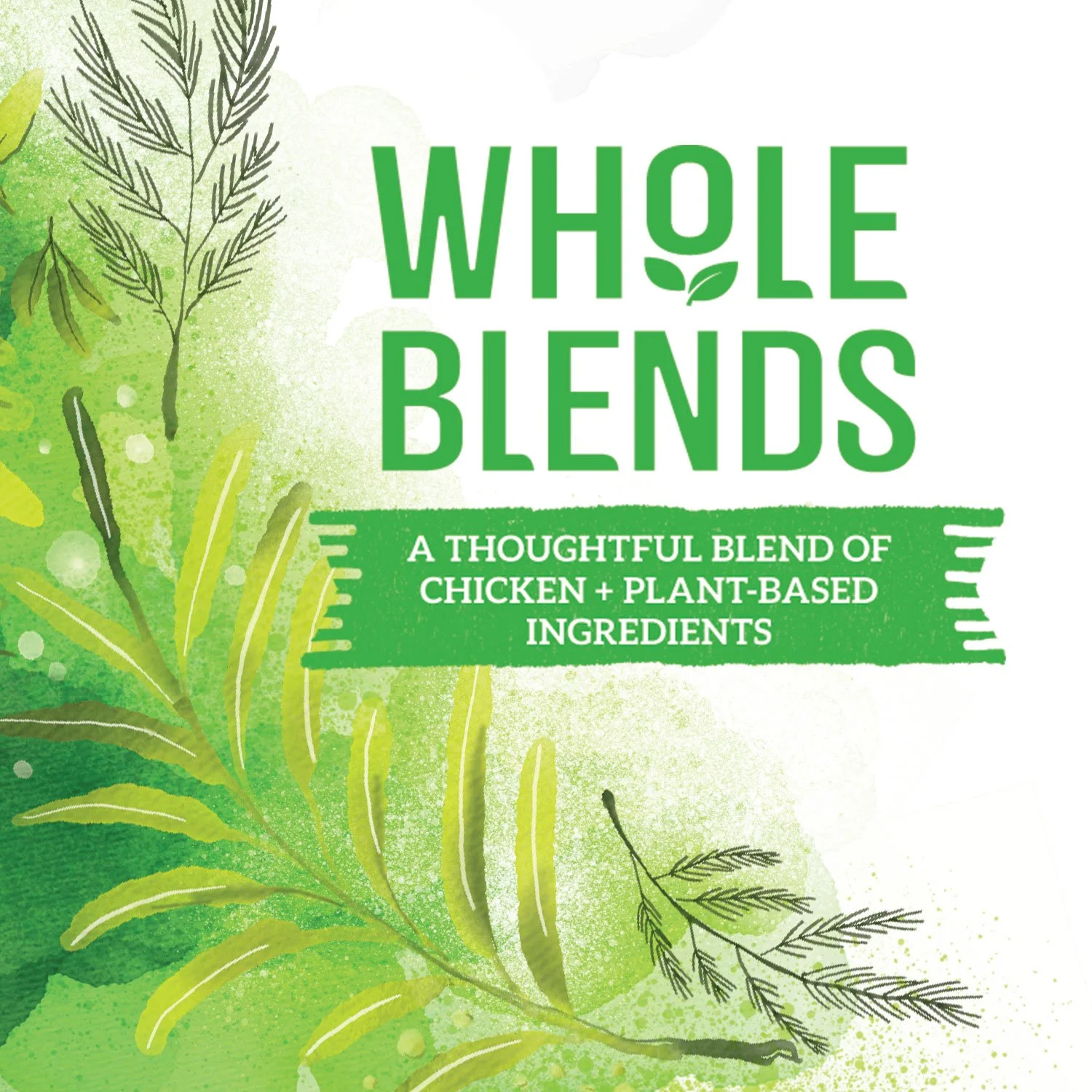
AIDELLS whole blends
LOGO & IDENTITY
PACKAGING
BRAND SYSTEM
ART DIRECTION
a thoughtful blend of meat + plants
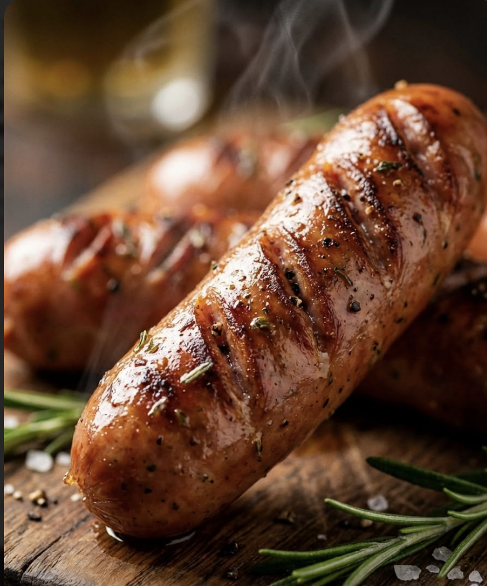
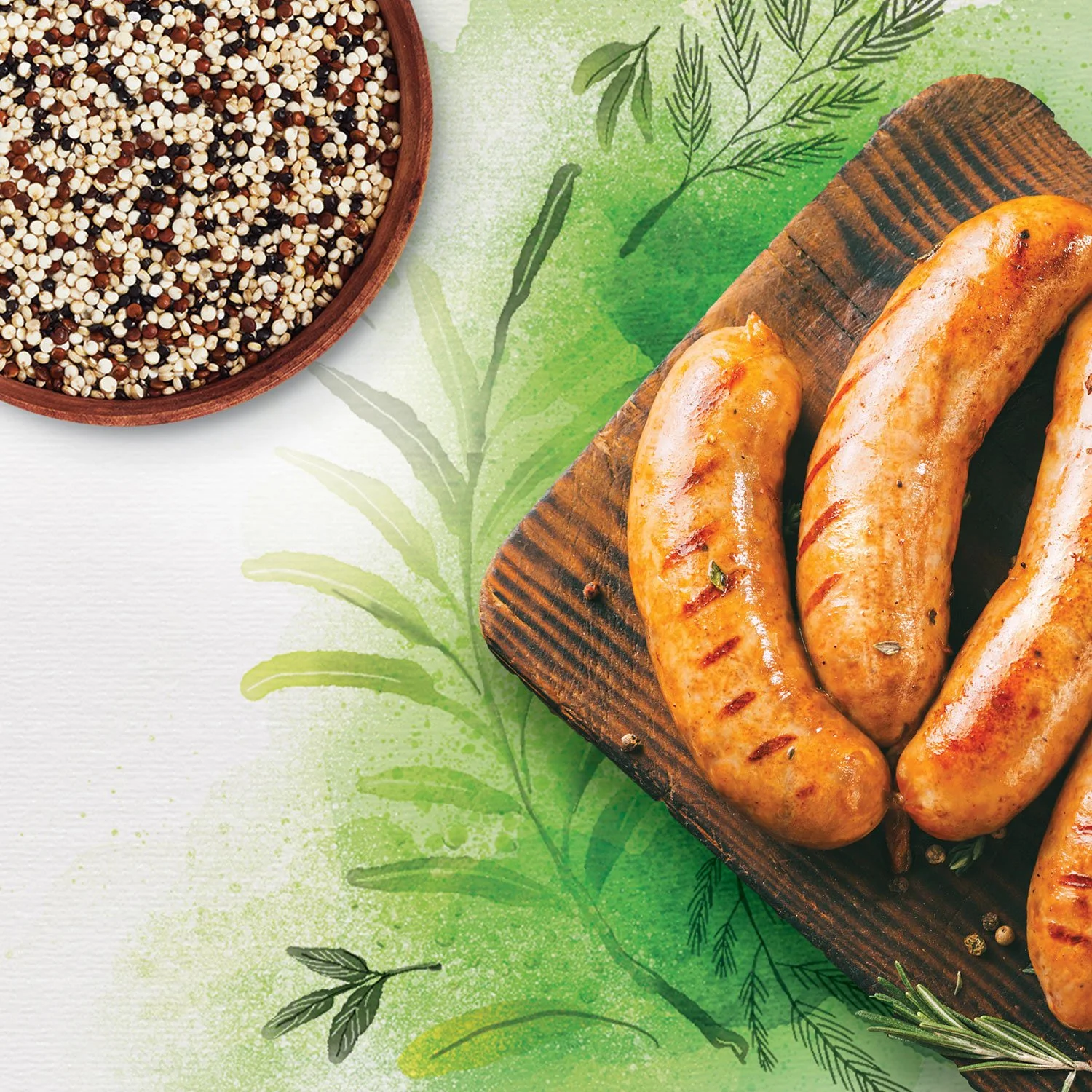
A new visual direction for Aidells Whole Blends, designed to make the balance of meat, vegetables and grains feel natural, crafted and contemporary.
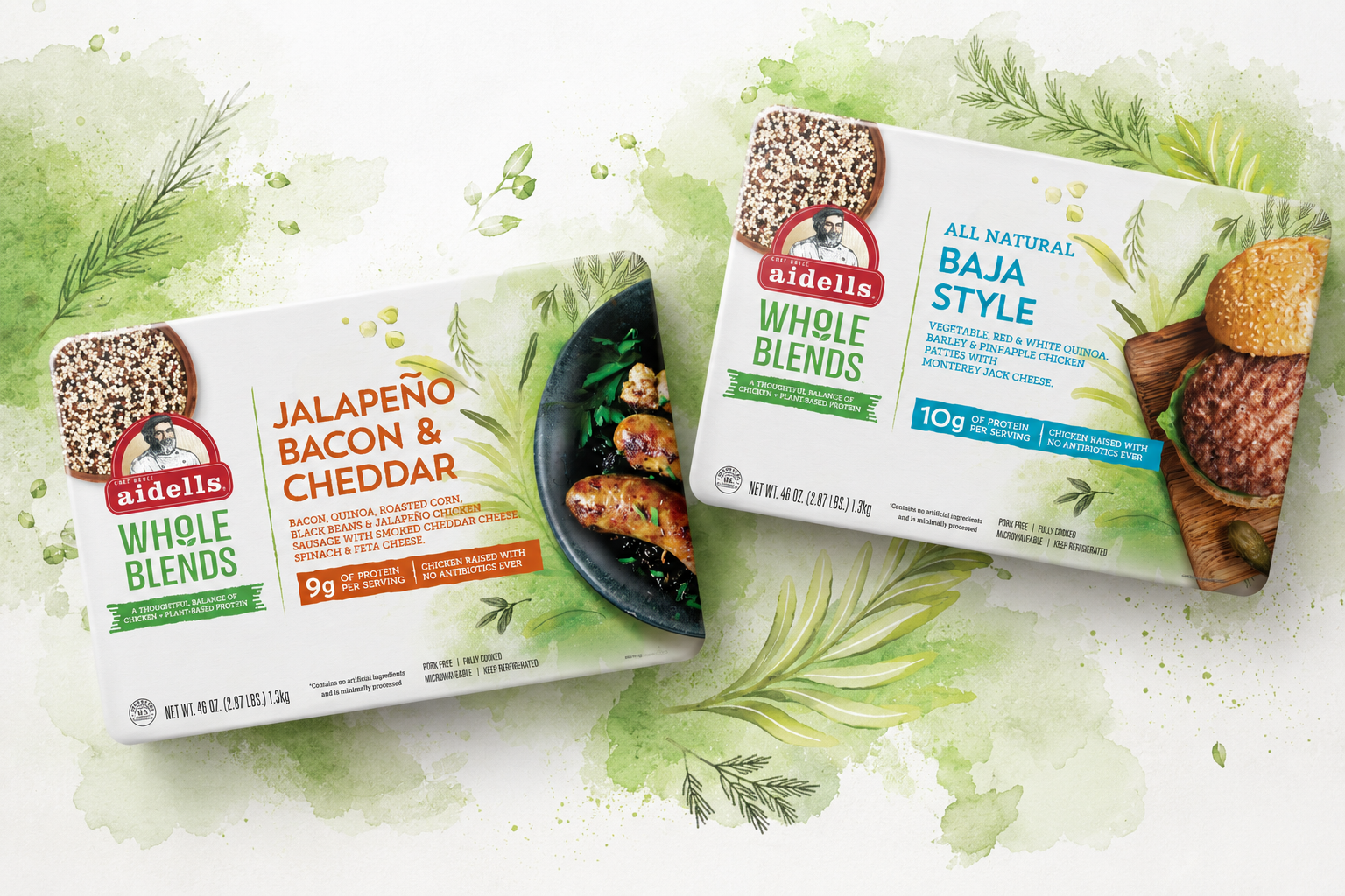
CRAFTED Illustrated ingredients and tactile textures create a handmade, premium feel.
BALANCED Photography and illustration work together to communicate the blend of meat + plant-based ingredients.
EFFORTLESS A clean, ingredient-led composition keeps the food hero while allowing the artwork to add personality.