

HEALTH & BEAUTY
MethoSkin
•
Dove
•
Colgate360
•
Bounce
•
Gillette
•
Summer's Eve
•
Vitafusion
•
Trojan
•
MethoSkin • Dove • Colgate360 • Bounce • Gillette • Summer's Eve • Vitafusion • Trojan •
METHOSKIN a new method for everyday skin
BRAND STRATEGY PRODUCT CONCEPT
PACKAGING IDENTITY EXPERIENCE

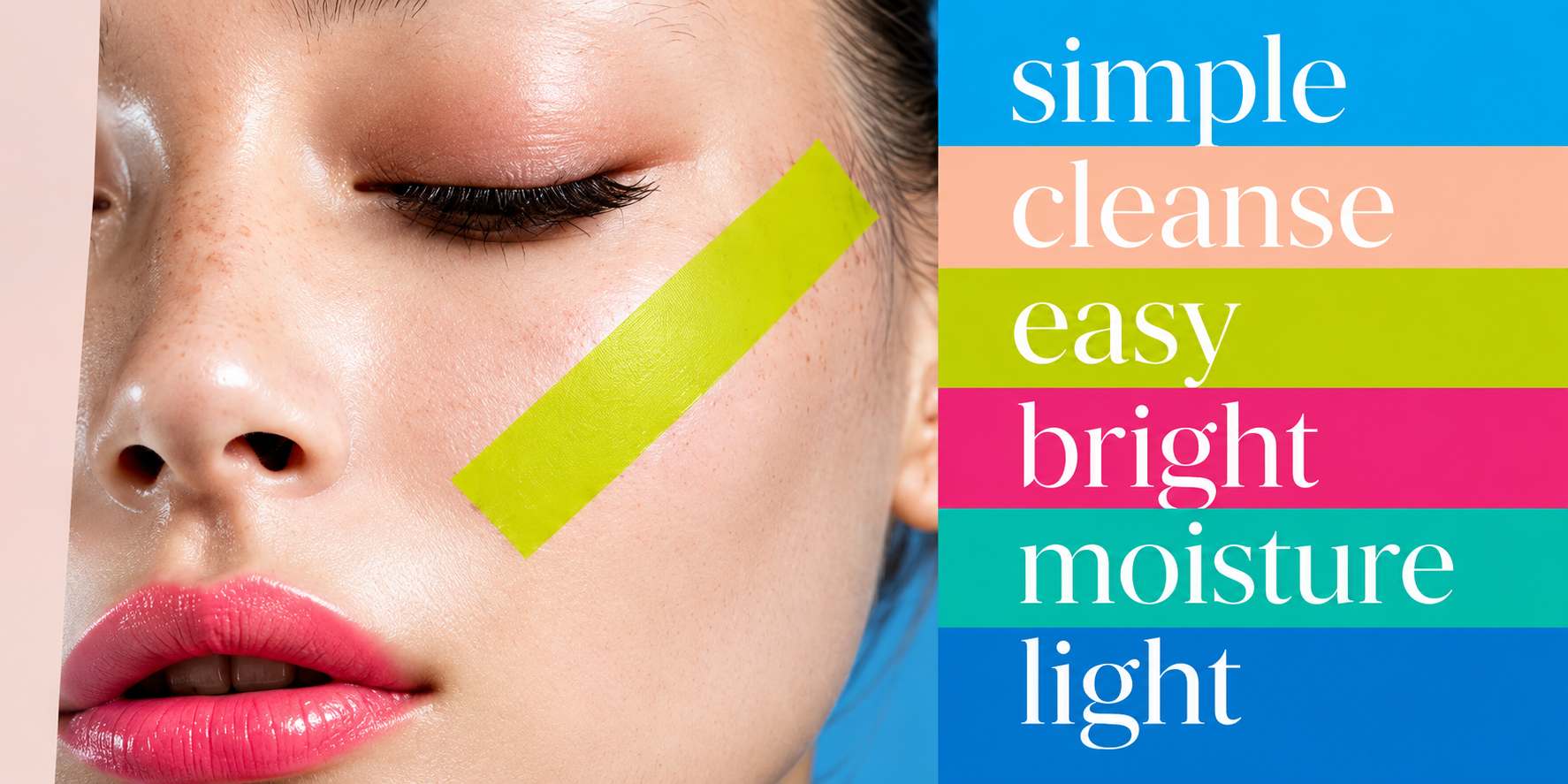
there’s a gap in the market.
LESS WATER. LESS WASTE. MORE EASE.

a new way to care for your skin.
Skincare is part of everyday life, but today’s routines are often complicated, bulky and water-heavy.
Consumers are looking for something simpler, smarter and more sustainable.
what is MethoSkin?
MethoSkin is a new skincare system designed for modern life.
The name combines Method + Skin a new method for approaching everyday skincare.
But there’s another idea hidden within the name: ETHOS.
An ethos of making skincare more simple, flexible and planet-friendly.
a new era in beauty.
MethoSkin gives you the flexibility to care for your skin in a way that’s personal, practical and better suited to modern life.
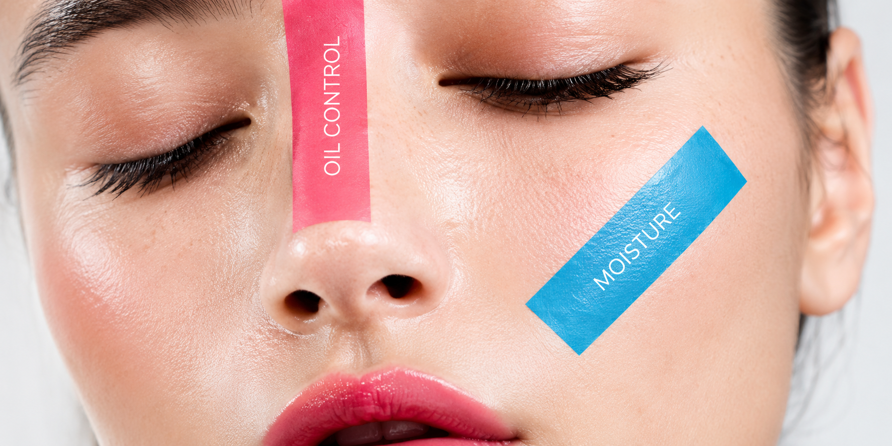
skincare that adapts to you.
Different areas of your face have different needs. MethoSkin lets you customize your routine with strips that deliver targeted benefits.
Oil control
Moisture
Blemish control
And more
a new way to deliver skincare.
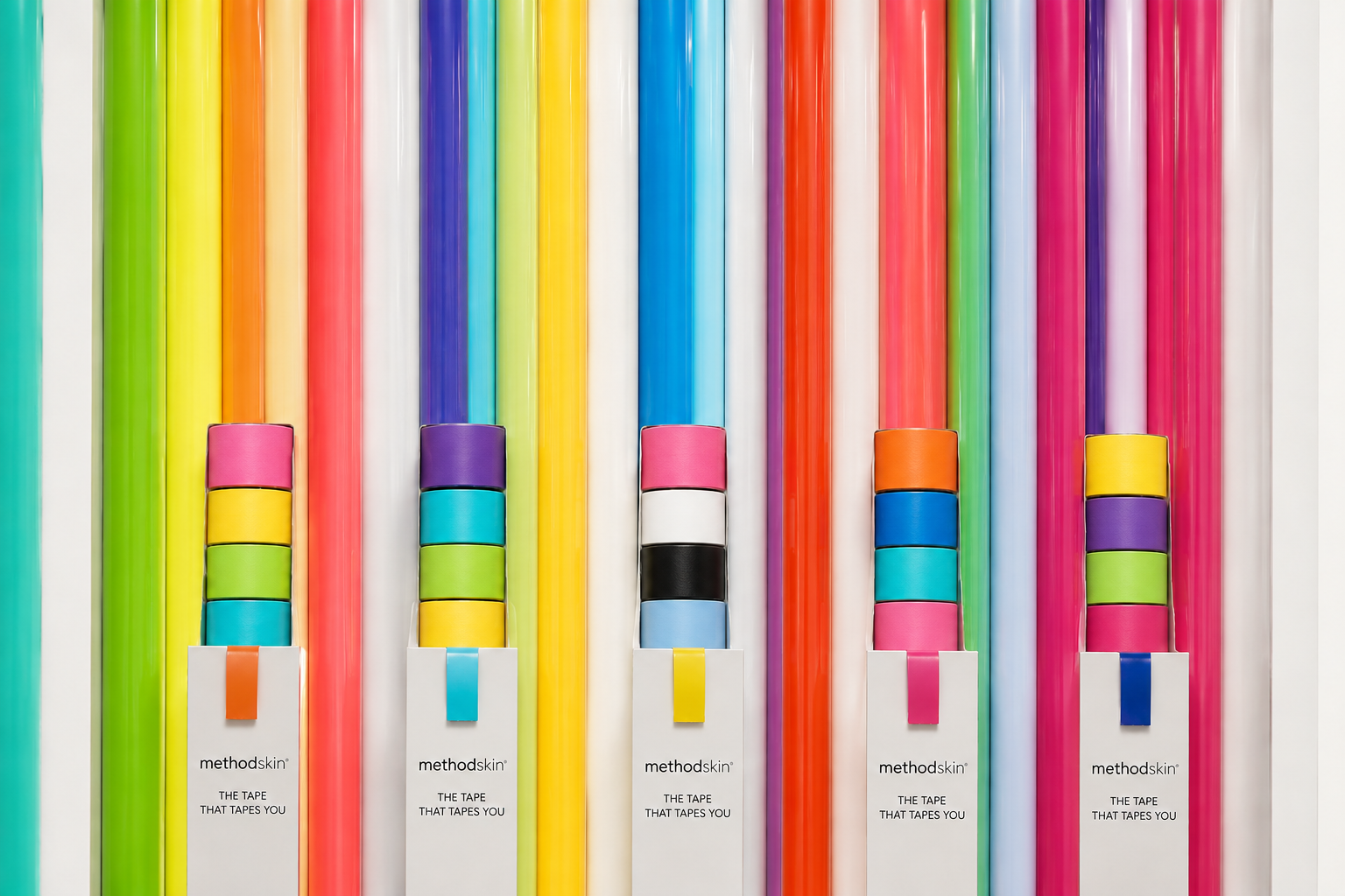
Inspired by Washi tape, MethoSkin comes in a portable, stackable dispenser. Simply pull, tear and apply.
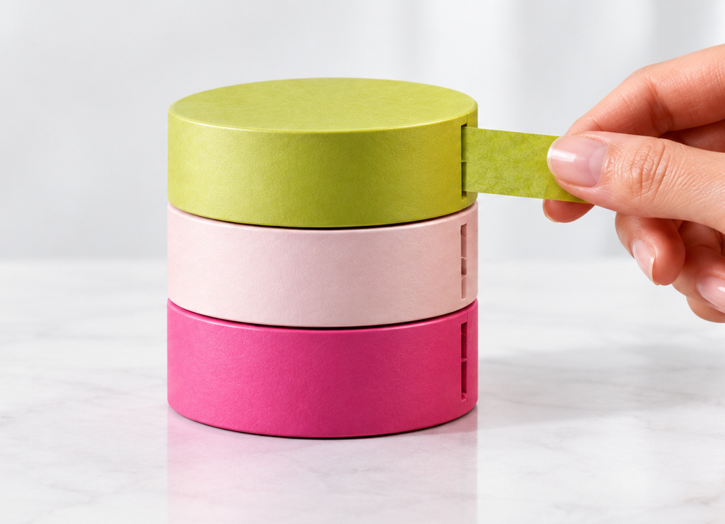
NO bottle
NO spills
NO bulky routine
And because it’s dry, MethoSkin travels easily, even in your carry-on.
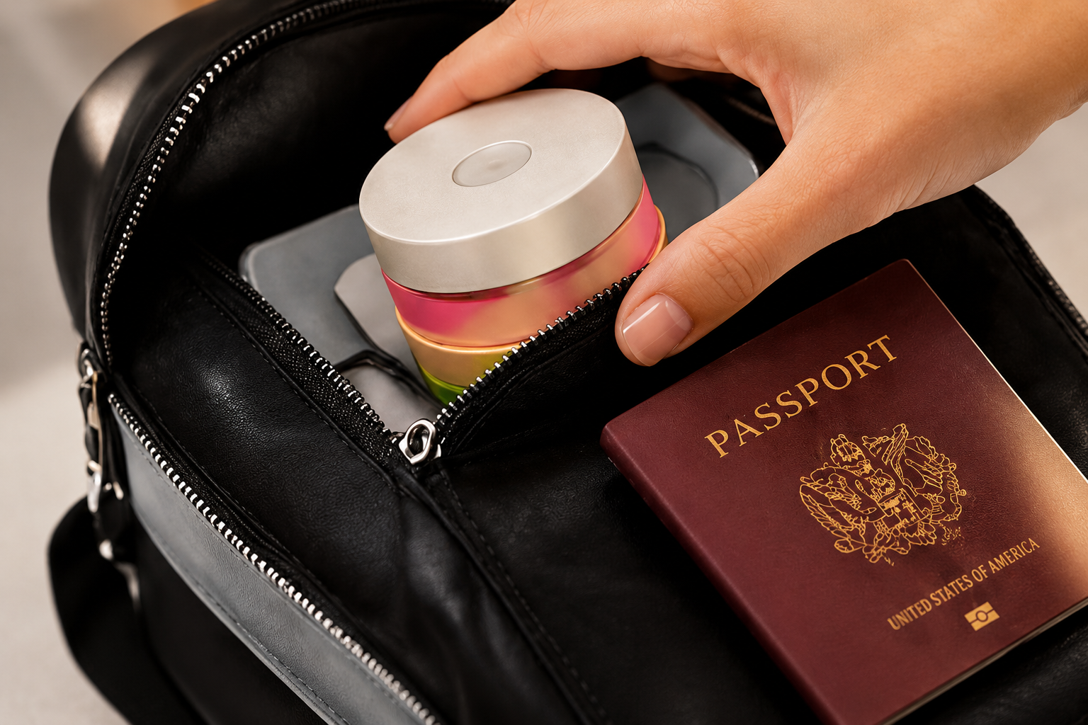
a new way to use skincare.
MethoSkin strips turn your routine into a simple, targeted ritual.
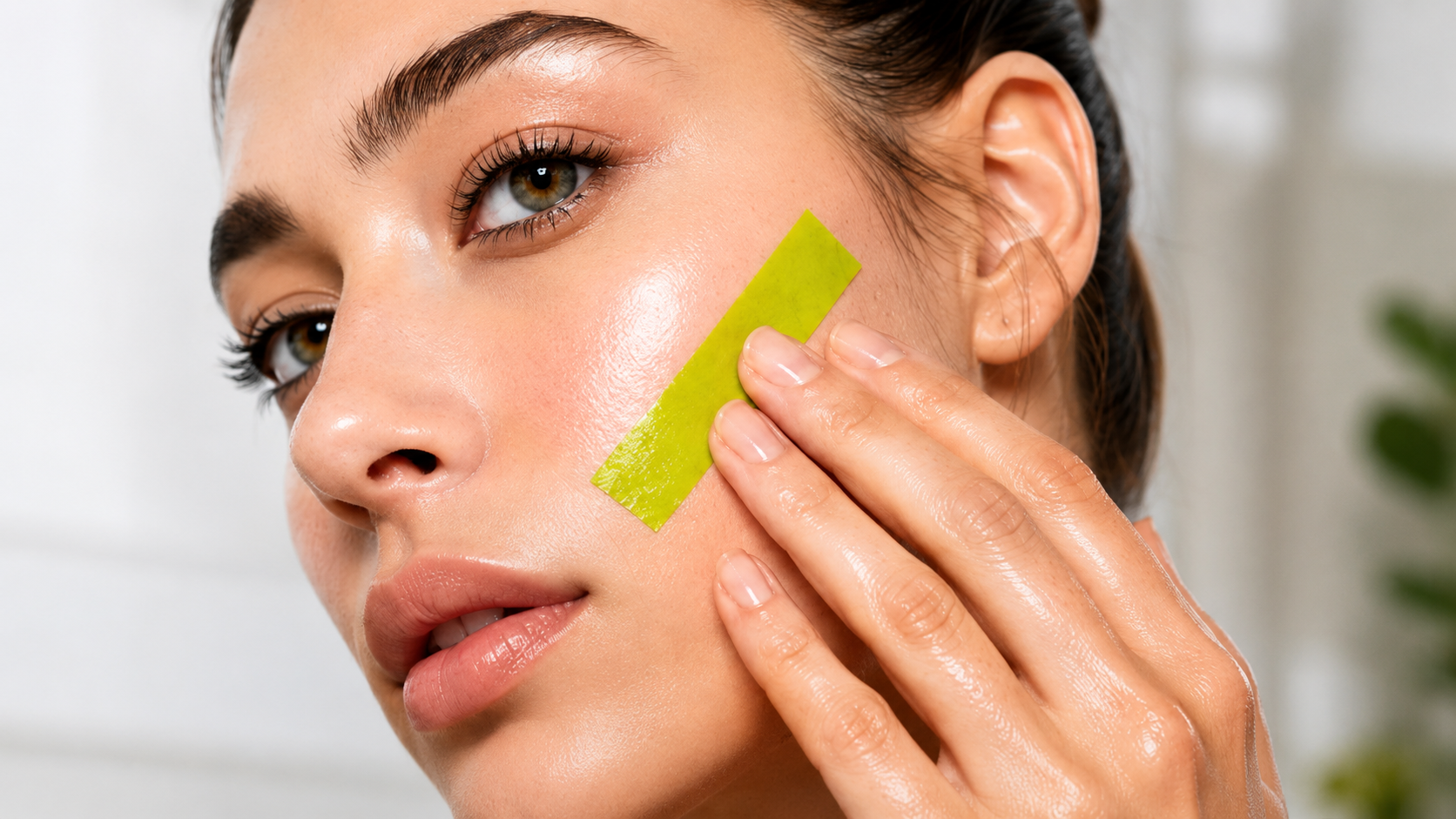
01 TEAR
————>
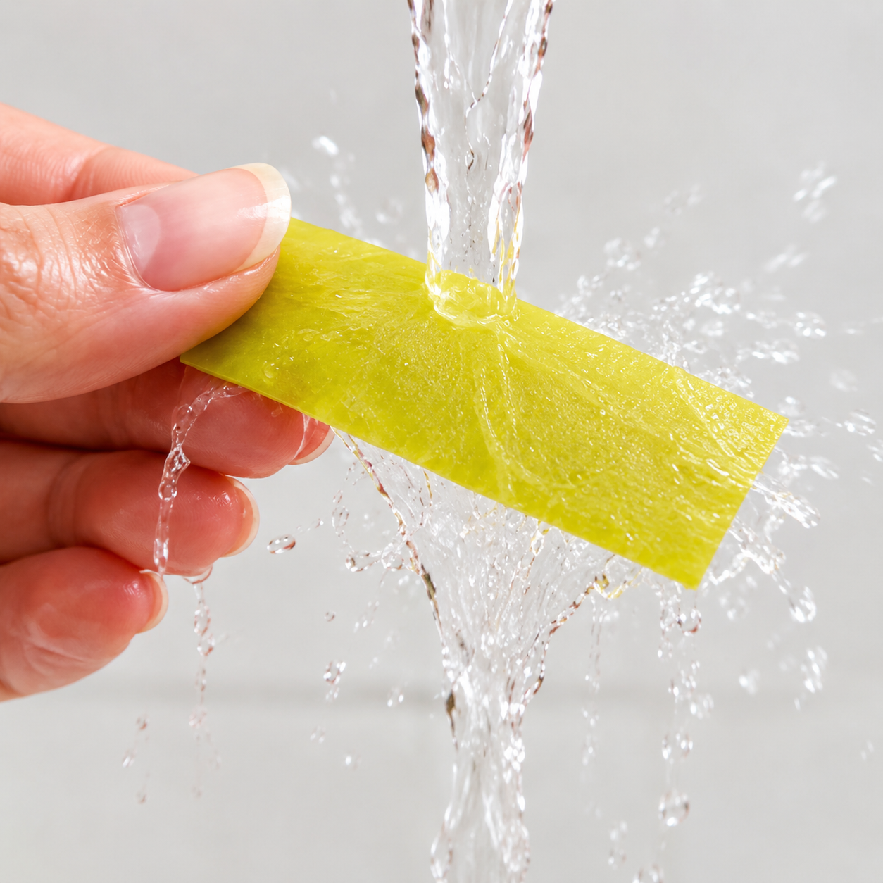
02 WET
————>
Pull a strip from the dispenser.
Activate with warm water.
03 APPLY
————>
04 MASSAGE
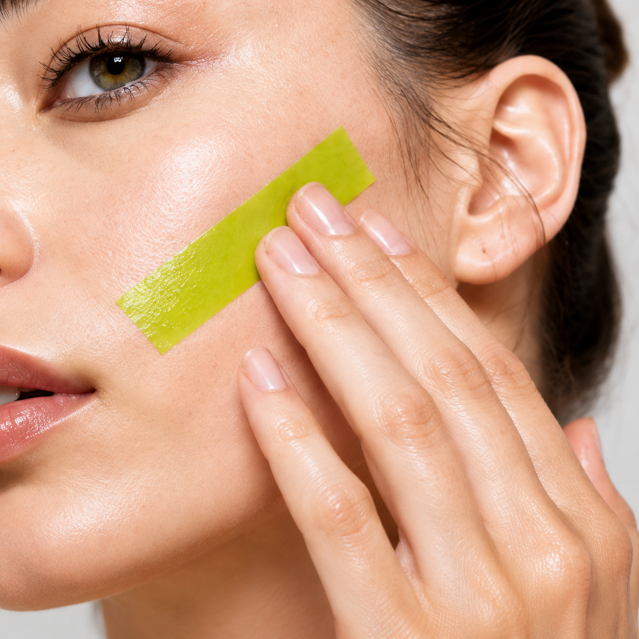
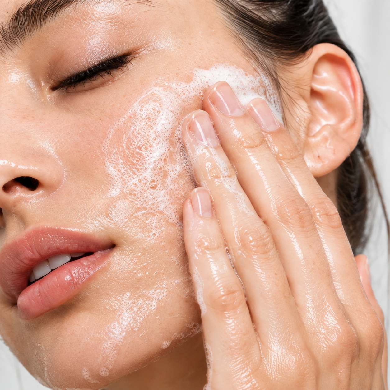
Work into skin to create a lather or cream.
Place on the desired area of skin.
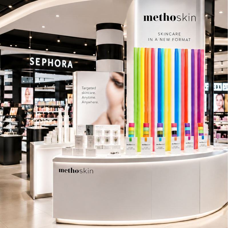
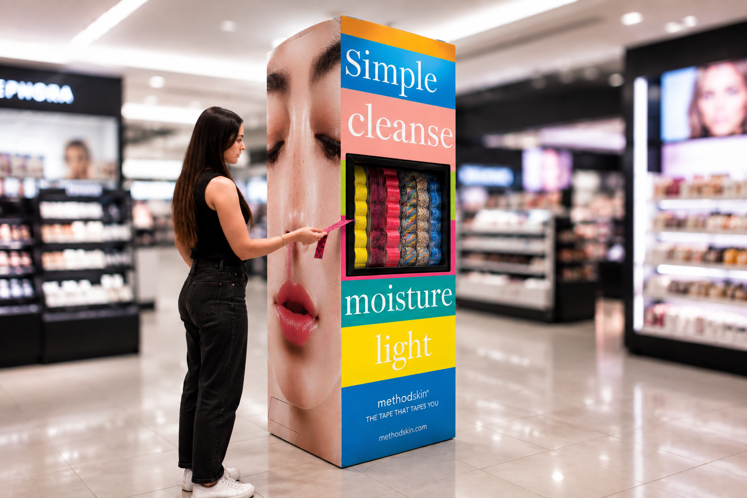
a skincare system designed to be seen.
At retail, MethoSkin transforms skincare into a colorful, intuitive and interactive experience, making it easy to discover, try and love.
the system becomes the space.
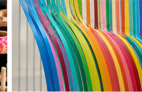
MethoSkin’s strips turn into architectural elements, creating pop-up environments and installations that bring the brand to life in unexpected ways.

DOVE hand hygiene
LOGO & IDENTITY
PACKAGING DESIGN
ART DIRECTION
care beyond clean.
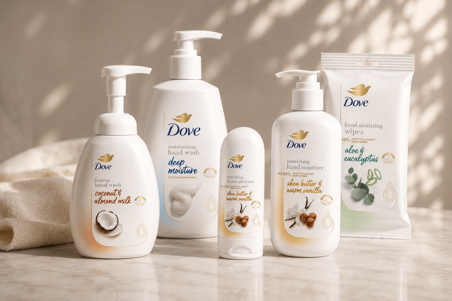
Bringing Dove’s signature care into everyday hand hygiene.
A refreshed product platform designed to make cleanliness feel more caring.
DOVE body wash
BRAND REFRESH CONCEPT EXPLORATION
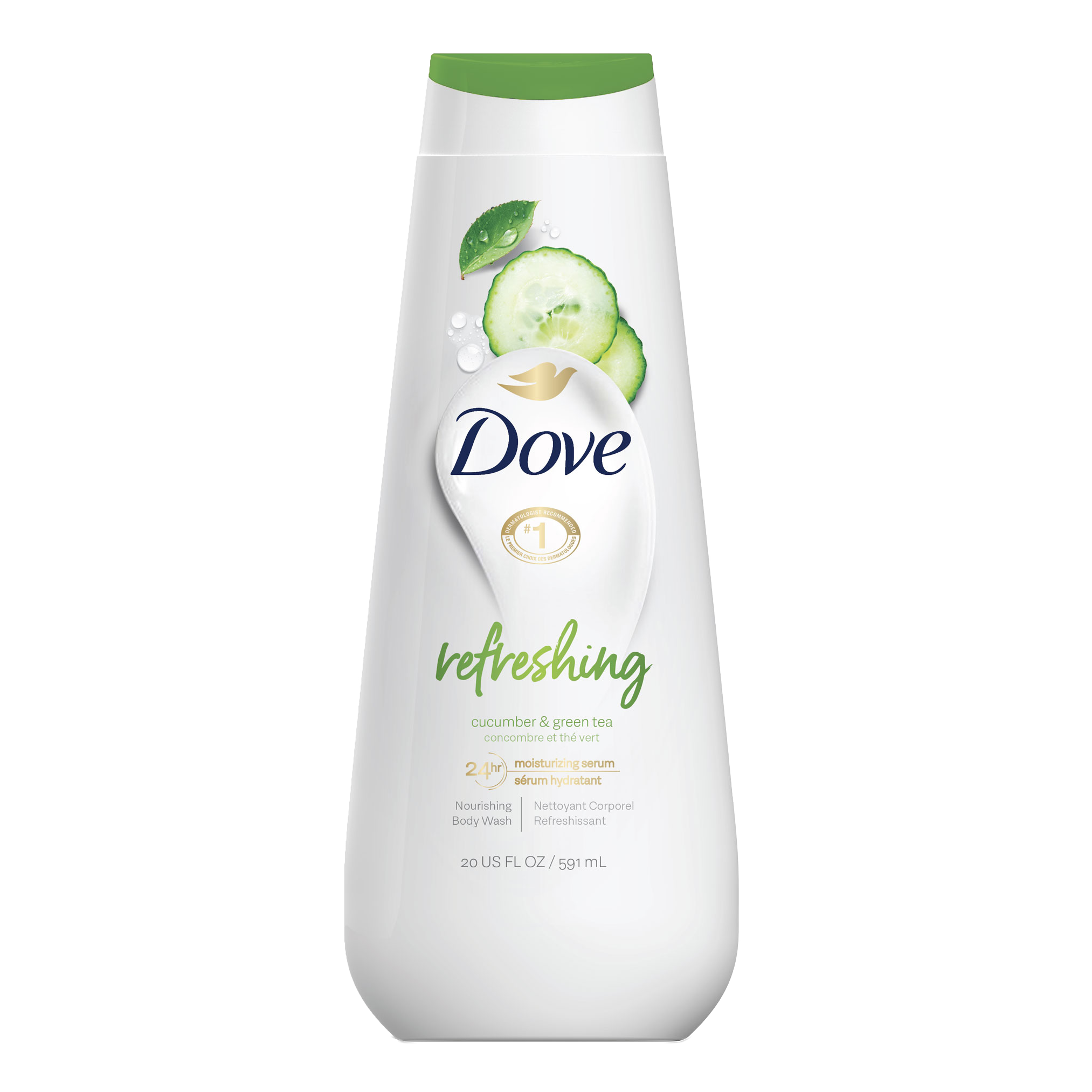
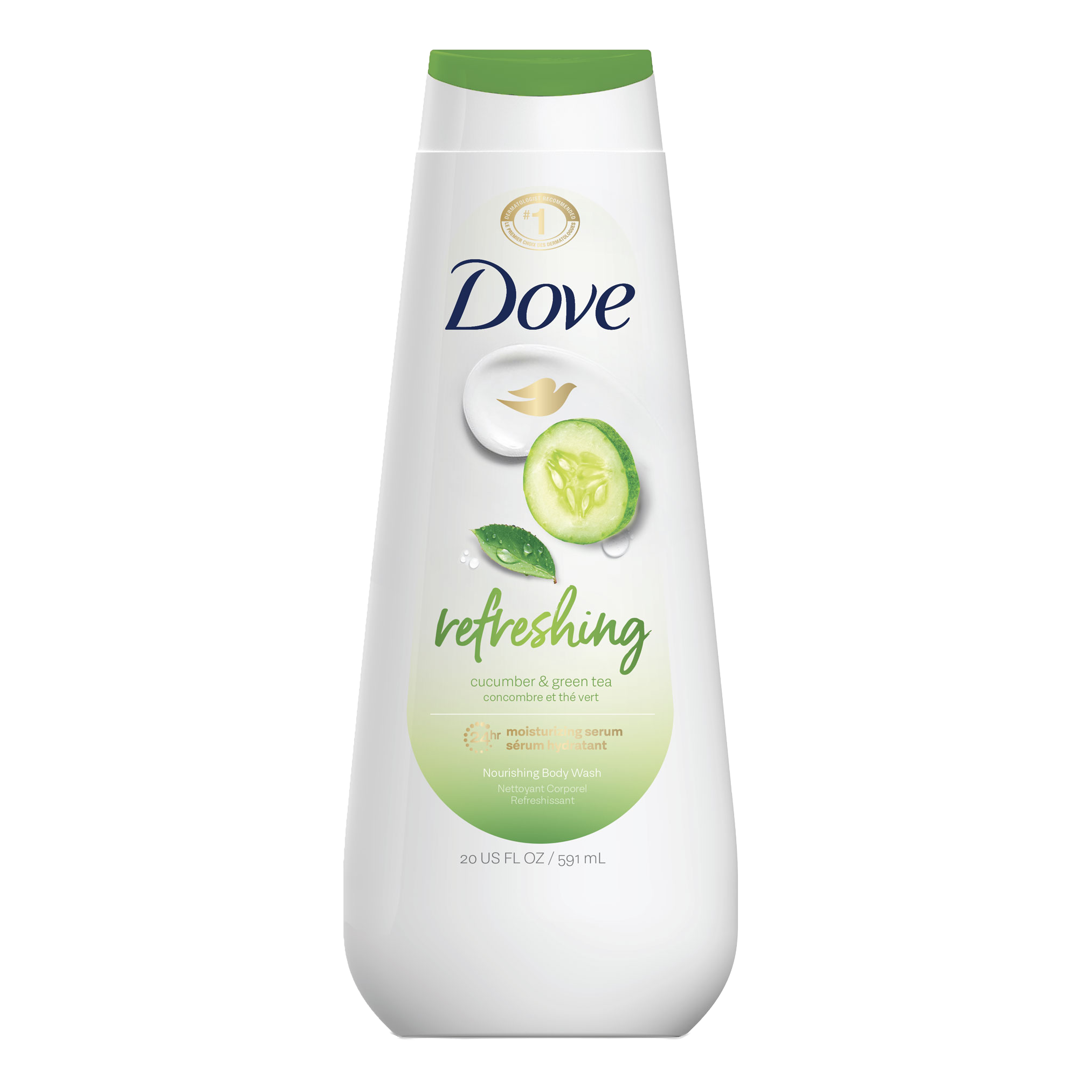
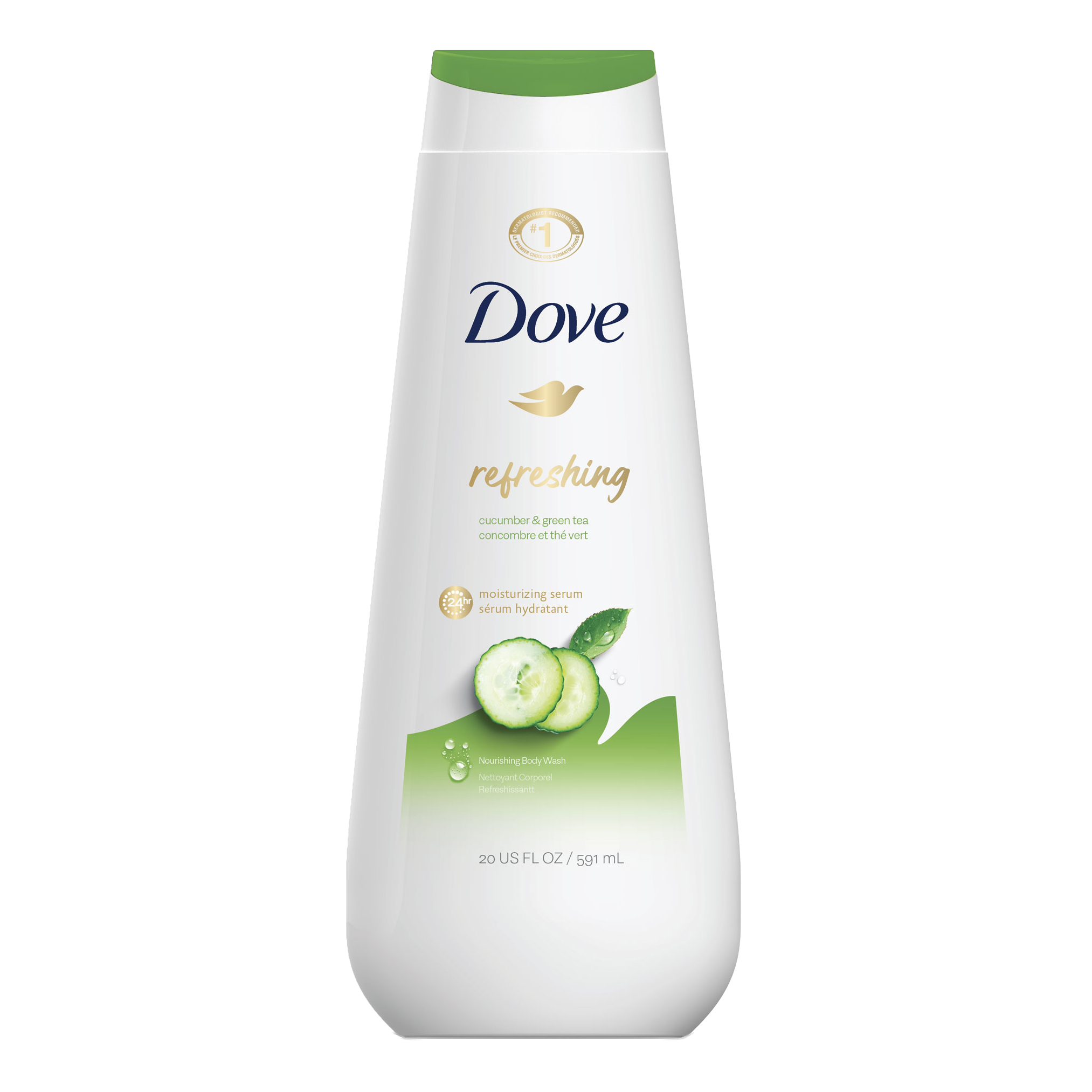
Reimagining Dove's iconic body wash packaging through a series of contemporary design explorations. Each concept investigates new approaches to brand hierarchy, visual architecture and ingredient storytelling while preserving the trust and familiarity of one of the world's most recognized personal care brands.
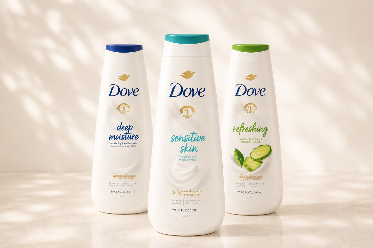
design exploration
Four distinct design directions were developed to explore different expressions of the Dove brand. Each concept balances premium skincare cues with clear variant differentiation, creating a cohesive packaging system that remains unmistakably Dove.
TROJAN explore with confidence
LOGO & IDENTITY PACKAGING
BRAND SYSTEM ART DIRECTION
pleasure, designed to explore.
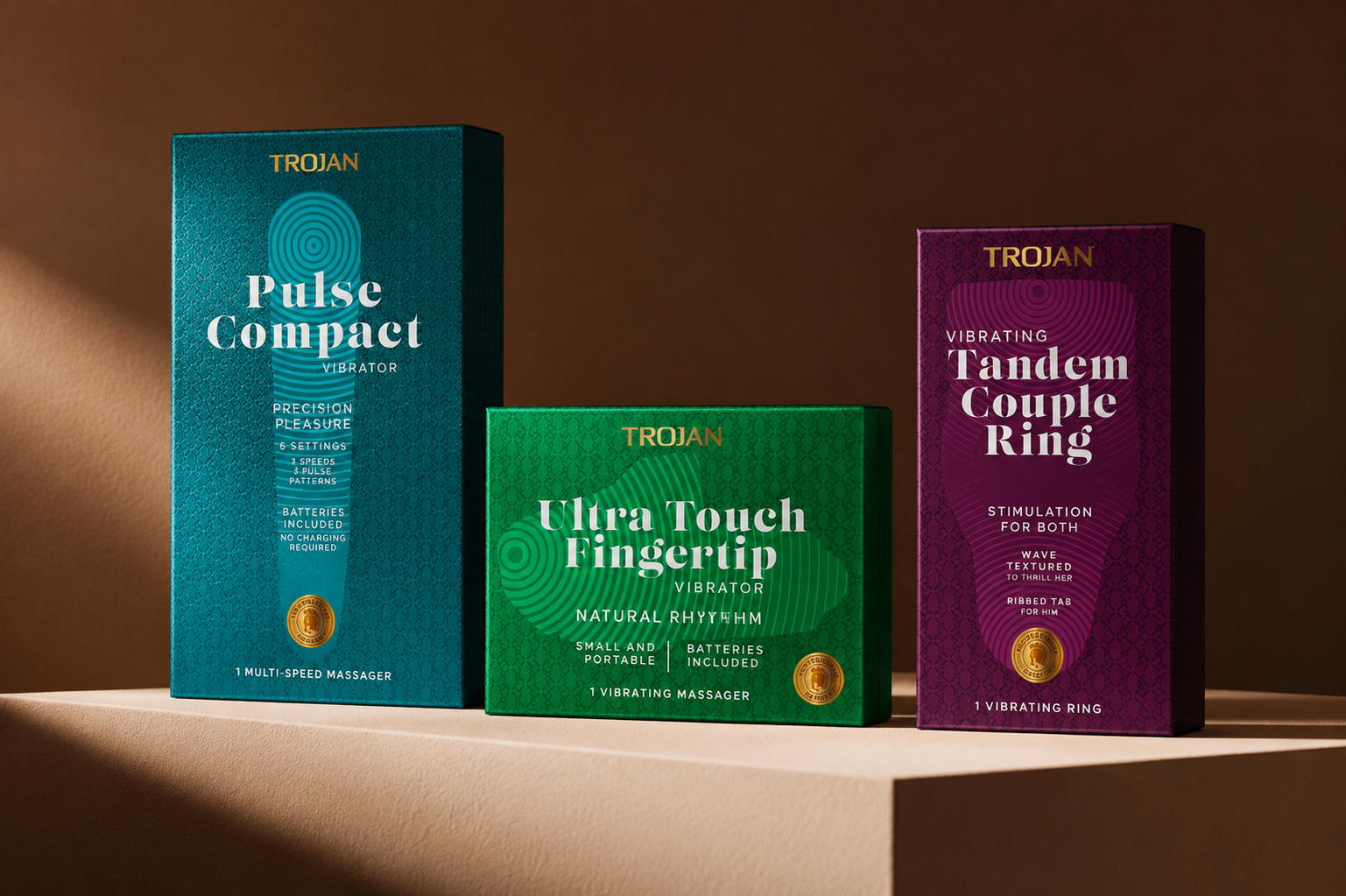
A colourful packaging system that brings individuality and discovery to the Trojan range.
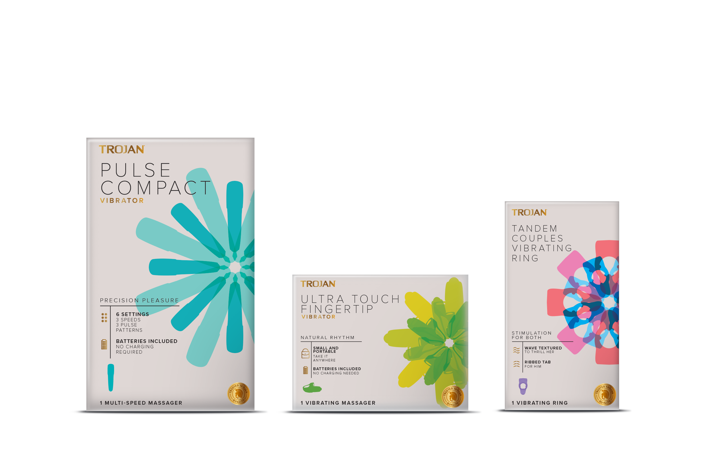
A MORE PLAYFUL EXPRESSION An expressive visual language built around movement, colour and individuality — creating a more contemporary approach to women’s pleasure.
IRISH SPRING legends
BRAND EXTENSION PACKAGING
ART DIRECTION
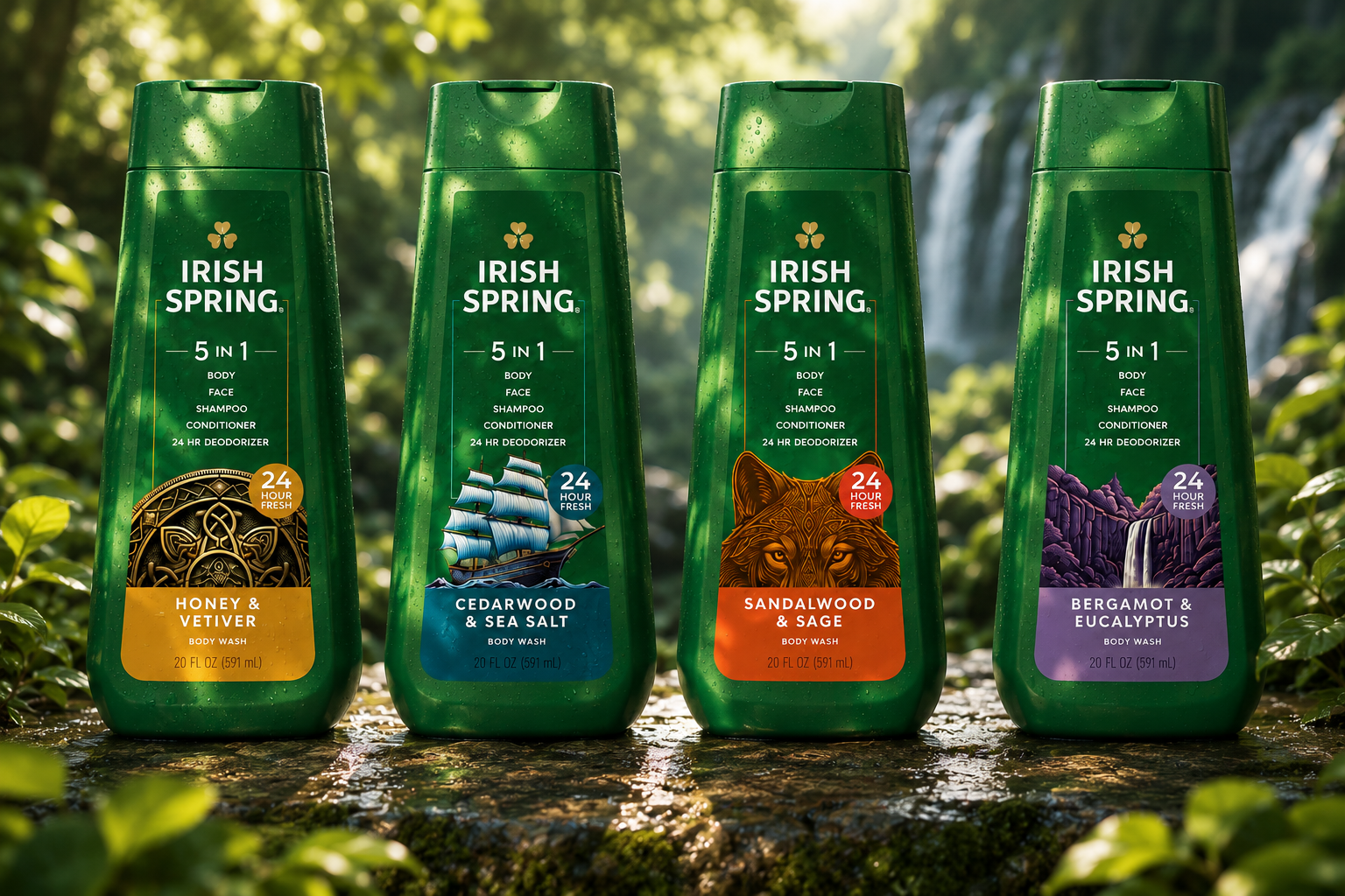
a new legend for a new generation.
Inspired by the myths, landscapes and enduring spirit of Ireland, the new Irish Spring LEGENDS brings together heritage and freshness in a bold contemporary expression.
Celtic symbolism, legendary creatures and the raw energy of Ireland’s natural landscape create a distinctive visual world across the range.
GILLETTE body
NEW PRODUCT LOGO PACKAGING
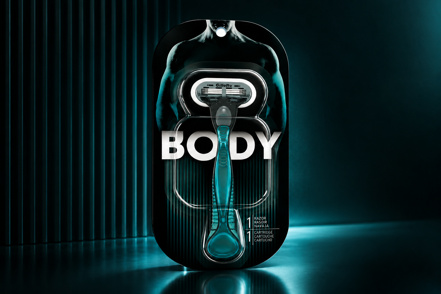
made for the whole body
A new razor designed specifically for manscaping, bringing Gillette’s shaving expertise to every part of the body.
A bold packaging system brings the product to life through a striking combination of deep black, electric teal and high-contrast typography.
The sculptural pack mirrors the form and movement of the body, while the translucent teal razor becomes the hero.
Communicating precision, technology and performance at a glance.
SUMMER’S EVE
BRAND EXTENSION PACKAGING ART DIRECTION
a softer, a modern Summer’s Eve
A refreshed packaging system that brings greater clarity, color and personality to the portfolio, making the range easier to navigate and shop.
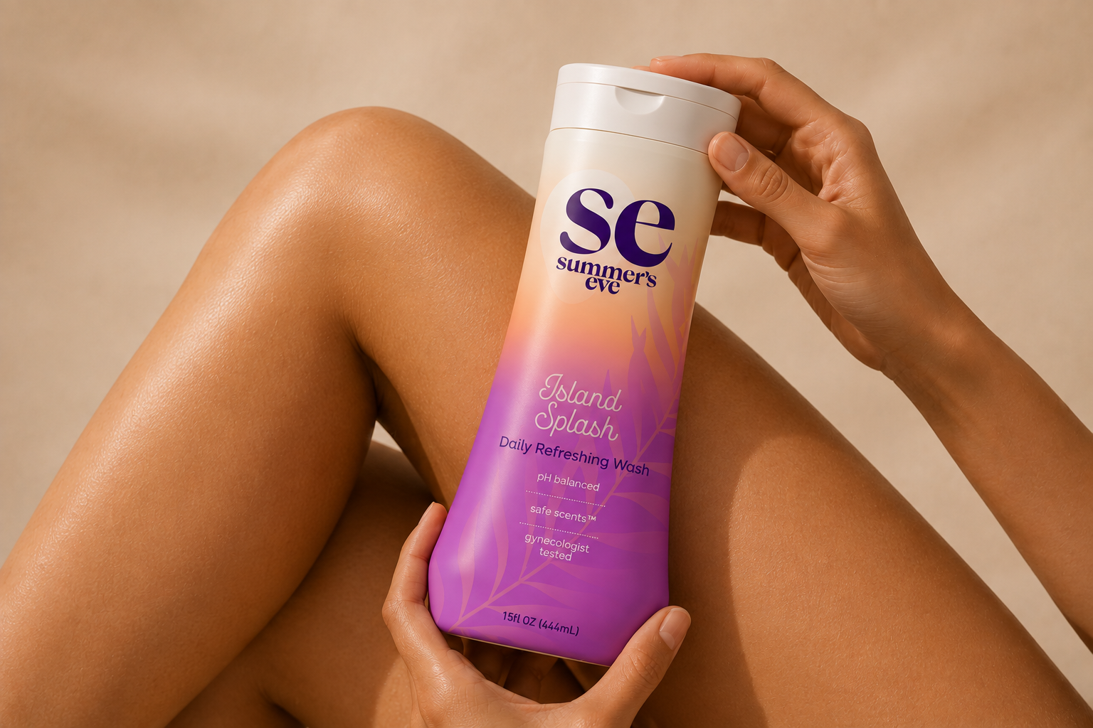
a gentler expression
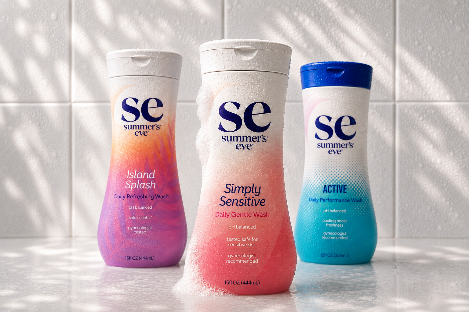
The new design moves Summer’s Eve toward a softer, more contemporary look, with simplified graphics, refined typography and a more approachable visual language.
colour that helps you shop
A stronger color architecture creates clear distinction between products and benefits, helping shoppers quickly find the right product while giving the range a more vibrant, cohesive presence.